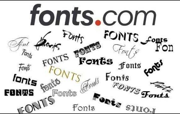
Fonts are an essential part of any design. They can make or break a project, be it a website, a logo, or even a PowerPoint presentation. With so many different fonts available, it can be challenging to decide which one to use and how to use it effectively. In this blog post, we'll guide you through everything you need to know about fonts and give you tips on how to use them to create stunning designs.
Understanding the Different Types of Fonts
Fonts can be broadly divided into four categories: serif, sans-serif, script, and display. Serif fonts have small lines, or "feet," at the bottom of the letters, which can make them appear more formal and traditional. Sans-serif fonts, on the other hand, do not have these lines and are often used for more contemporary designs. Script fonts mimic cursive handwriting and work well for invitations or formal documents. Display fonts are unique and eye-catching and are usually used for headlines or logos.
Pairing Fonts
Pairing fonts can be tricky, but it's necessary to make your designs look polished and put-together. It's best to use two fonts that complement each other, rather than using two that clash. A good rule of thumb is to use a sans-serif font for body text and a serif font for headings. For example, you could use Times New Roman for headings and Arial for body text.
Using Fonts for Emphasis
Using different fonts can help you emphasize specific words or phrases. Bold fonts can convey a sense of importance, while italic and underlined fonts can add emphasis to certain words. It's important not to overdo it, though, as using too many different fonts can make your design look cluttered and confusing.
Choosing the Right Font Size
The font size you choose can have a significant impact on the readability of your content. Body text should generally be around 16-18pt, with headings being larger. However, the size you choose will depend on the design and the font you're using. It's essential to test the size and make sure it's easy to read for your intended audience.
A Word of Caution on Trendy Fonts
While trendy fonts can be tempting to use, it's essential to be careful not to overdo it. Using a trendy font is fine if it fits with your design and brand, but using it just because it's currently popular can make your design look dated in the future. It's essential to prioritize functionality over trendiness.
In conclusion, fonts are a crucial aspect of design, and it's essential to choose the right one for each project. Understanding the different types of fonts and how to pair them can help you create stunning designs that convey your message effectively. Remember to choose a font size that's easy to read and be cautious of using trendy fonts. By following these tips, you'll be on your way to creating beautiful designs that communicate your message effectively. You can use free fonts at police d'écriture en ligne


